#Current10: So where did that red oval come from?
by Luke Taylor
January 23, 2015
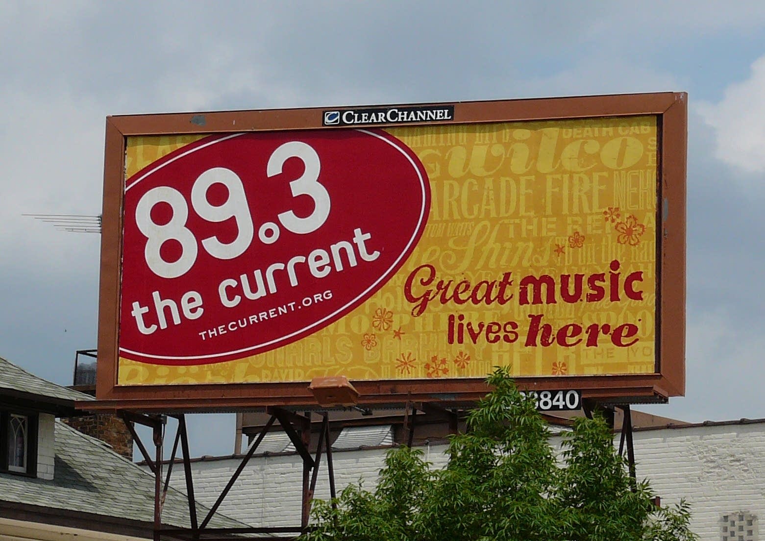
From t-shirts to water bottles to stage backdrops — when people think of The Current, they often picture the ubiquitous red-oval logo. But where, exactly, did that oval come from? We asked former MPR graphic designer Dale Cooney to shed some light on the topic. Here's what he had to say:
How did you strike on the idea for the oval?
I'll just say straight up that the oval was not even my idea. Our traffic manager at the time, Kim Bryant-Kahler, had the idea that, as part of the station launch, we should do a bumper sticker.
And she suggested a European-style bumper sticker because, honestly, she could get a good deal on them. You know those stickers, they read "D" for Germany and so forth. Kim found out we could print a bazillion of them inexpensively. That was the original idea.
The only thought I contributed was, "Hey, this is a great idea to just use as the logo, because you can really plunk it down anywhere. You can put it on any surface or any billboard or any ad, and it just commands the space."
And so my only contribution to the whole idea was just to make that bumper sticker more like the logo for the station. That was it.
Did you have a hand in picking the color?
Yeah. Back when we did the MPR original rings identity, we were just using that identity as kind of a foundation for a color palette as we designed, and we thought the red was nice and bold. When we were doing the overall corporate branding, we pulled that red from the rings to make it consistent with the broader corporate identity but also to have it be its own thing.
That's how you got the blue for MPR News and green for Classical MPR and red for The Current — that was the one I wanted, the big, bold, bright color.
What is your reaction to the audience response to the oval?
I don't know … I'm really happy that it has taken off and become something that people have embraced. I think it's less about the design and more about the music that comes out of The Current. I think that's where people's allegiance is; the design is just a way for them to share that allegiance.
If the station weren't great and the product weren't awesome, it wouldn't matter what the logo looked like!
You worked as a designer at MPR from 2002 to 2009. What are you doing now?
I went back to graduate school for urban and regional planning, and now I am working in community development in St. Paul. I'm primarily doing single-family housing acquisition, rehab — basically land-development work, but for the non-profit sector — because I guess I'm just wired that way!