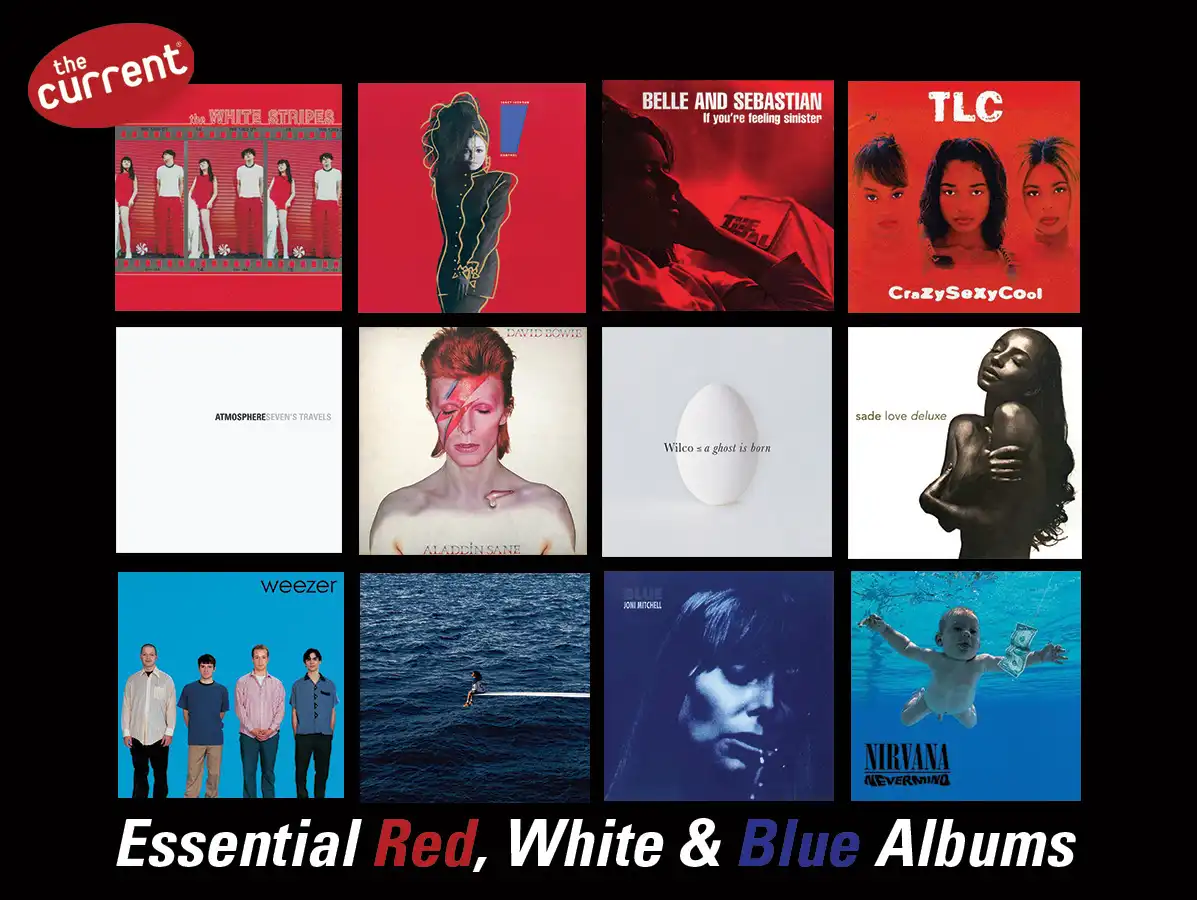
30 essential red, white, and blue album covers
by Ali Elabbady
June 30, 2026
On Saturday, July 4, 2026, the United States of America will be 250 years young. A lot has happened in our country’s history, and the red, white, and blue colors in the American flag have been there through it all.
These days, Olympic athletes, World Cup stars, and frozen treats are among the examples of pop-culture iconography keeping this color combo visible in our lives. There are also many great albums with covers dominated by red, white, or blue.
To ring in the United States’ Semiquincentennial, here are 30 essential album covers — many for recordings by American artists, but not exclusively — featuring the colors of the American Flag.
Red
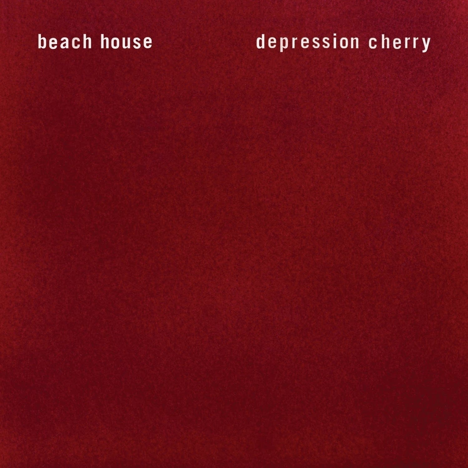
Beach House - Depression Cherry (2015)
Alex Scalley and Victoria Legrand worked with designer Brian Roettinger for the album’s velvet jacket for both the vinyl and CD versions of Beach House’s fifth album. For the cassette, they employed an opaque and transparent red shell in place of a velvet tape jacket, but one can imagine the possibilities, right?

Belle and Sebastian - If You’re Feeling Sinister (1996)
The artwork for the Scotland indie rock band’s critically acclaimed follow-up to Tigermilk is among the finest of their catalog’s many monochromatic covers. It came when frontman Stuart Murdoch captured a photo of his friend Ciara after venting to each another about their personal relationship situations.

Fugazi - 13 Songs (1989)
The all-red design with black text artwork for this compilation of Fugazi’s earlier EPs was meant to capture the aesthetic of the DIY-punk ethos that was instrumental to their upbringing. This is the legendary Washington, D.C., post-hardcore band’s most commercially successful release.

Janet Jackson - Control (1986)
For her sophomore album, Jackson worked with fashion illustrator Tony Viramontes to create the stylized cover for Control. Author Dean Rhys Morgan detailed in Bold, Beautiful and Damned: The World of Fashion Illustrator Tony Viramontes how Jackson was "transformed from a former child star into an assured, fashion-forward figure with her trendsetting big hair and severe all-black ensemble. This album was all about Janet and who she wanted to be.”

Kraftwerk - The Man-Machine (1978)
For the group’s seventh album, Ralf, Florian, and the rest of Kraftwerk were inspired by the works of Russian artist El Lizzitsky, and his adapting of the suprematism art movement found in posters from the 1920s and 1930s. Look close enough, and one might see “inspired by El Lizzitsky” in the album’s inner sleeve.

Pavement - Slanted and Enchanted (1992)
If Pavement’s debut album cover art looks familiar, it's because it was originally the album cover for Ferrante & Teicher’s 1964 album, Keyboard Kapers. Like many other Pavement releases, it was defaced and repurposed in a collage style that was popular throughout the 1990s.

Queens of the Stone Age - Songs for the Deaf (2002)
Queens of the Stone Age’s third album of aggressive hard rock was conceptualized and created as part of frontman Josh Homme’s Desert Sessions collective series. The cover was produced in several different colors, with the most common being the burgundy-red background, which evokes the arid climate of Palm Desert, California.

Redman - Dare Iz a Darkside (1994)
New Jersey rapper Redman, an artist destined to get a mention here, is buried up to his neck on the cover of his second album, photographed by Danny Clinch (Bruce Springsteen, Bob Dylan, Eddie Vedder). The red filter embodies the chaos of this time in his artistry. The look was inspired by Funkadelic’s 1971 album, Maggot Brain.

TLC - CrazySexyCool (1994)
For TLC’s multi-platinum follow-up to the group’s playful debut, Oooh…On the TLC Tip, everyone was seeing red. A simple illustration of the trio against a vibrant red backdrop showcased the group’s maturity and worked well to indicate their departure from R&B conventions in that moment.

The White Stripes - The White Stripes (1999)
In a 2005 interview with Rolling Stone, Jack White noted that the band’s fascination with red and white “came from peppermint candy. I also think they are the most powerful color combination of all time. In Japan, they are honorable colors. Those colors strike chords with people.”
White

Atmosphere - Seven’s Travels (2003)
Slug & Ant’s third album, and first under the Epitaph label, was originally supposed to feature different artwork at first. (It was later reissued with the original artwork in 2013.) It was later changed to a plain white cover in memory of a fan in Albuquerque, New Mexico, who was murdered by a janitor at a concert in 2003. The incident was later highlighted in “That Night” off the duo’s You Can’t Imagine How Much Fun We’re Having.

The Beatles - The Beatles [The White Album] (1968)
The Fab Four’s own Paul McCartney worked with conceptual artist Richard Hamilton for this significant departure from Sgt. Pepper’s Lonely Hearts Club. The album was in a plain white sleeve with “The Beatles” embossed on the jacket, and each copy had its own serial number, as if it were a limited edition copy of the album.

Bloc Party - Silent Alarm (2005)
The photo taken by Ness Sherry for the British band’s debut looks like the peak of a Minnesota winter wonderland but it was actually taken in Northamptonshire, England. It was originally part of Sherry’s high school project before it became one of the defining album images of the 2000s.
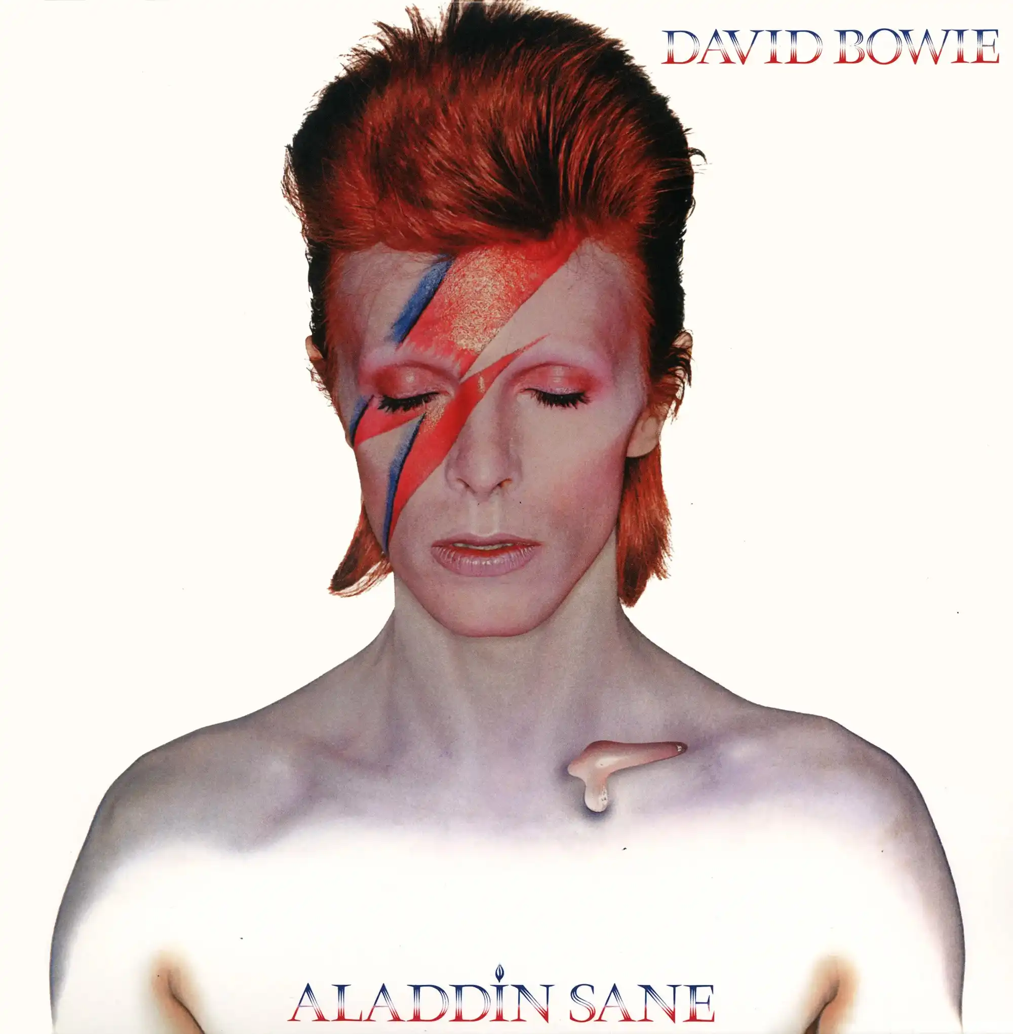
David Bowie - Aladdin Sane (1973)
For Bowie’s sixth studio album, Brian Duffy and Pierre Laroche worked with David Bowie to create a signature look. It polarized audiences when the album was first released, but now is among the most celebrated and revered images of Bowie.

Fleetwood Mac - Fleetwood Mac (1975)
Photographed by Herbert Worthington, who would become a frequent creative collaborator with the band, Fleetwood Mac’s 10th album cover continued a long-standing tradition of not featuring all members. Both Mick Fleetwood and John McVie stand in front of a doorway, with a crystal ball floating in the air. What’s in the crystal ball, though?

The Notorious B.I.G. - Ready to Die (1994)
The classic debut from Biggie Smalls shows what appears to be a singular image of a just-born Christopher Wallace captured by photographer Butch Belair. The child in question was later identified as Keithroy Yearwood in a 2011 piece for the New York Daily News.

Pink Floyd - The Wall (1979)
Cartoonist Gerald Scarfe created the stark lettering for the British psychedelic pioneers’ 10th album and magnum rock opus. He was hired after Roger Waters had a falling out with Storm Thorgerson, who was responsible for the bulk of the band’s artwork up until The Wall.

Sade - Love Deluxe (1992)
Sade worked with frequent collaborator Scottish photographer Albert Watson to create this album’s simple yet iconic image. It communicates the album’s exploration of complexities surrounding love, hardship, and loss. A print of the cover image is in the National Portrait Gallery’s permanent collection.

Sonic Youth - Goo (1990)
For the cover of their sixth full-length album, Sonic Youth recruited artist Raymond Pettibon. His drawing is modeled after a photograph of two witnesses in the notorious Moors murder trial in England. Pettibon is most familiar to fans for designing the bulk of covers for Black Flag’s earlier works, and has also designed covers for Iggy Pop, Foo Fighters, and many others.

Wilco - A Ghost Is Born (2004)
Taking home a Grammy for best recording package in 2005, the image of an egg against a strong backdrop with italicized lettering was one of the first ideas suggested to Wilco by art director Dan Nadel and designer Peter Buchanan-Smith.
Blue

Geese - Getting Killed (2025)
The band’s breakout fourth album, produced by Kenneth Blume, features as detailed to The Fader, “[guitarist Emily] Green in a white dress, being blurred by a lens flare. In her right hand is a trumpet held closely to her face, while the left hand holds a revolver pointed directly at the camera.” The image was shot on a rooftop by photographer Mark Sommerfeld, with additional editing by Kyle Berger.

Madonna - Ray of Light (1998)
For her seventh studio album, Madonna teamed up with photographer Mario Testino and stylist Lori Goldstein to create the album cover. It’s based on the album’s recurring themes of water and air against the backdrop of electronica, trip-hop, and dance music that permeate throughout the album. The photo itself by Testino came during the wind-down of their second shoot.

Metallica - Ride the Lightning (1984)
The second studio album from Metallica got its title from Kirk Hammett. According to Metal Hammer, he was reading The Stand by Stephen King while the band was recording its debut album, Kill ‘Em All. The title, slang for execution by the electric chair, stuck with him and lead singer James Hetfield, so they worked with design company AD Artists to put the electric chair front and center, with lightning bolts flashing against a blue backdrop.

Joni Mitchell - Blue (1971)
Regarded as one of NPR’s 150 greatest albums made by women, Blue has the lone album cover from Joni Mitchell’s early discography that wasn’t based upon one of her illustrations or creations. The idea for tinting Tim Considine’s intimate photo of Mitchell came from art director Gary Burden.

Nirvana - Nevermind (1991)
For their second studio album, Kurt Cobain and his label turned to photographer Kirk Weddle to film the album’s iconic imagery. The baby in the photo, Spencer Elden, has been interviewed multiple times about his memories of the album shoot, and has sued the band multiple times, too.

Portishead - Dummy (1994)
The debut album from the Bristol trio utilizes a still film image of lead singer Beth Gibbons. It originates from a short film called To Kill a Dead Man, which landed the band their record contract. That short film is a bonus on Portishead’s Roseland NYC Live DVD, and some clips were used for the “Sour Times” music video.

Prince - Prince (1979)
For his breakthrough second album’s cover, Prince worked with photographer Jurgen Reisch to create the look against a turquoise-blue backdrop. Designers Lynn Barron and George Racon, as well as calligrapher Terry Taylor, brought their talents together to arrive at the super-minimal, understated result.

Spoon - They Want My Soul (2014)
With their eighth studio album, Texas rockers Spoon employed Todd Baxter to create something eerie. As Baxter told Trend Hunter, “The idea was for the images to feel like film stills from a ’70s psychological thriller -- inspired by lots of films from that era.”

SZA - SOS (2022)
For her second studio album, SZA was inspired by this 1997 photo of Princess Diana aboard a yacht in Portofino, Italy. She told Hot 97 during an interview for the SOS album cycle “Originally I was supposed to be on top of, like, a shipping barge. But in the references that I pulled for that, I pulled the Diana photo, because I just loved how isolated she felt, and that was what I wanted to convey the most.”

Weezer - Weezer [The Blue Album] (1994)
Inspired by a not-so-proper Beach Boys greatest-hits album, the cover photo of Rivers Cuomo and crew was captured by photographer Peter Gowland. Karl Koch however didn’t like how Matt Sharp’s head was tilted, so they used Photoshop to put his head in alignment with the rest of the band’s poses.
This list could have been much, much longer. And several of the artists featured — notably Sonic Youth, Belle & Sebastian, and Beach House — have multiple covers that have strong single-color designs.
Please share your favorite red, white, or blue album covers that we missed in the comments below.